Back 


Meet Landing Page
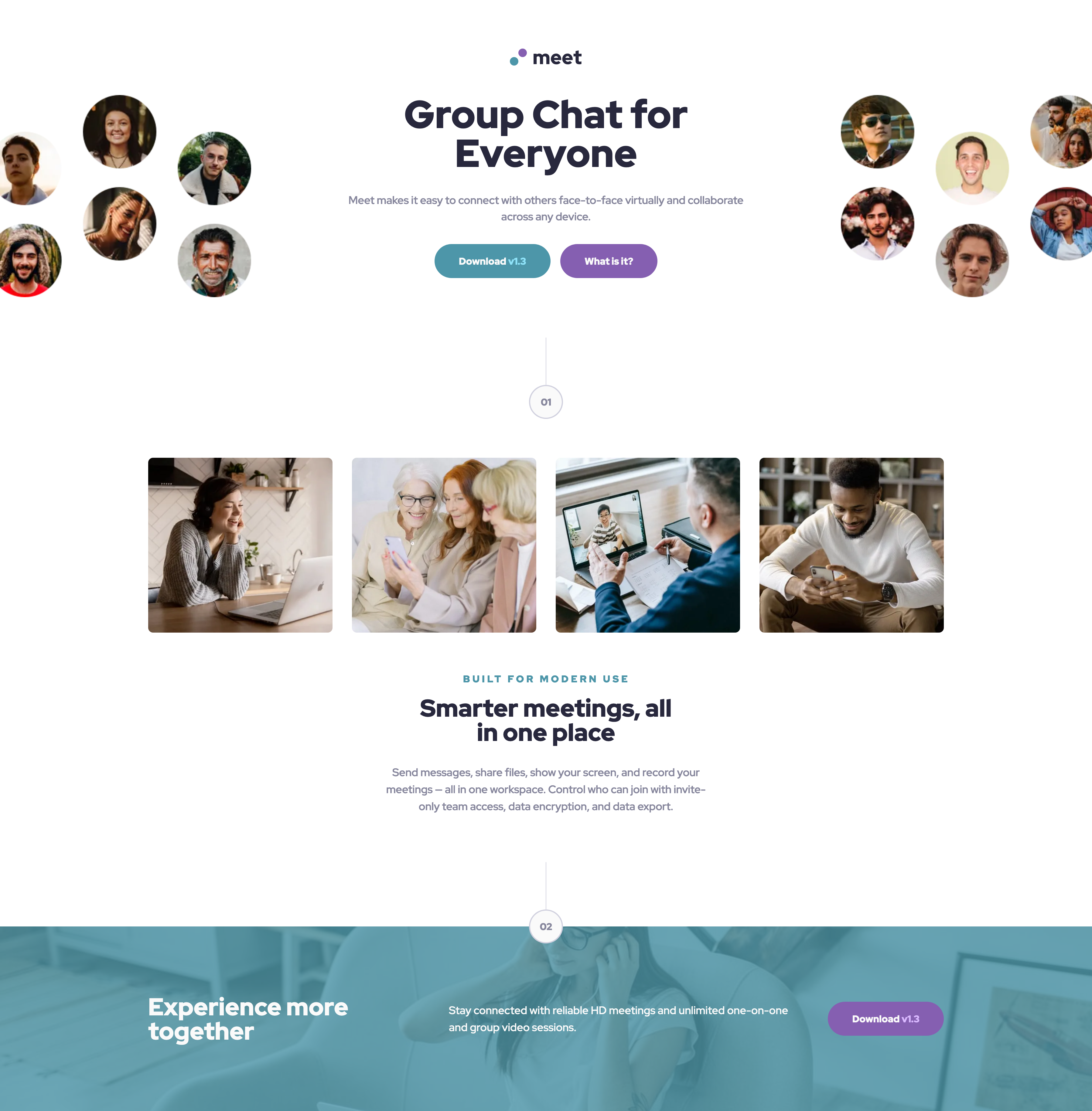
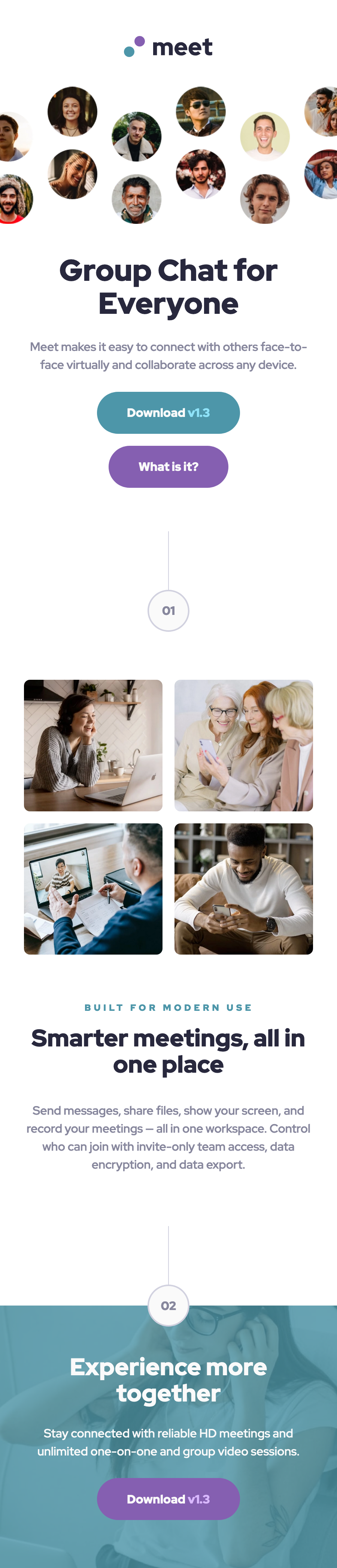
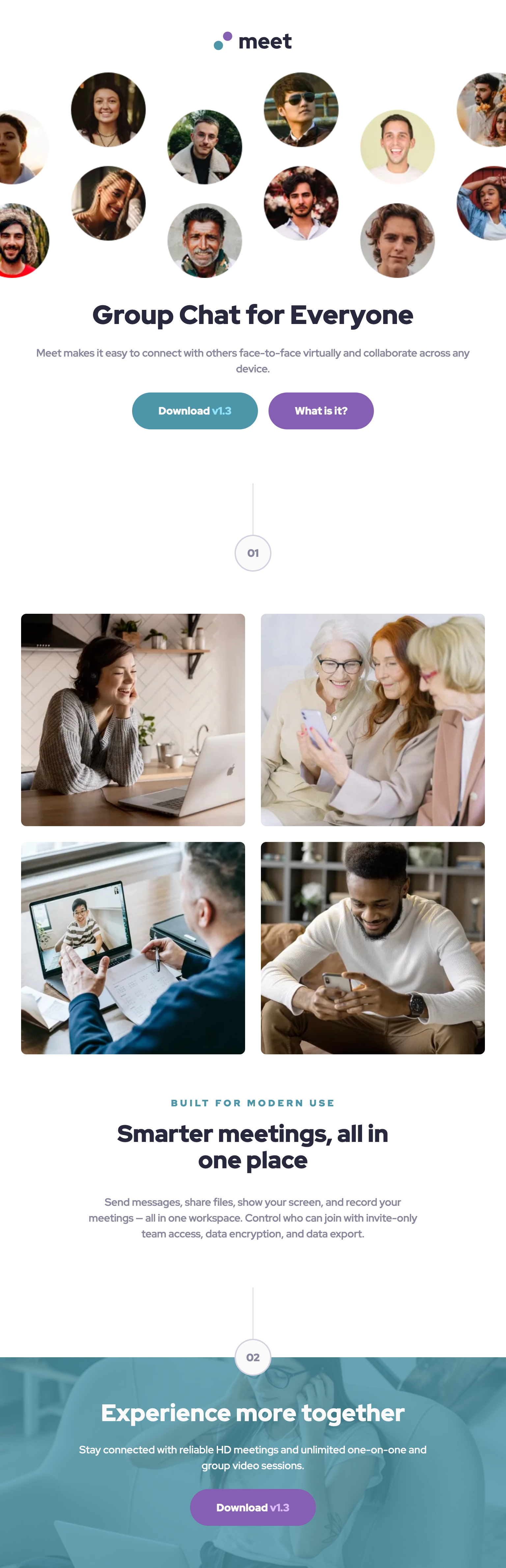
A landing page for a mockup video-chatting app called Meet with three designs across screen sizes, a challenge by Frontend Mentor.
Links
Media
Desktop
Mobile
Tablet
The challenge
Users should be able to:
- View the optimal layout depending on their device’s screen size
- See hover states for interactive elements
- Appreciate the hard work I put in
The process
I had a lot of trouble styling the image of people left and right to have a responsive gap, until I realized in the /assets folder they provided all 3: hero-left, hero-right and hero-all. I felt very silly after that, but other than that there hasn’t been any other major issues during the creation.