Previews
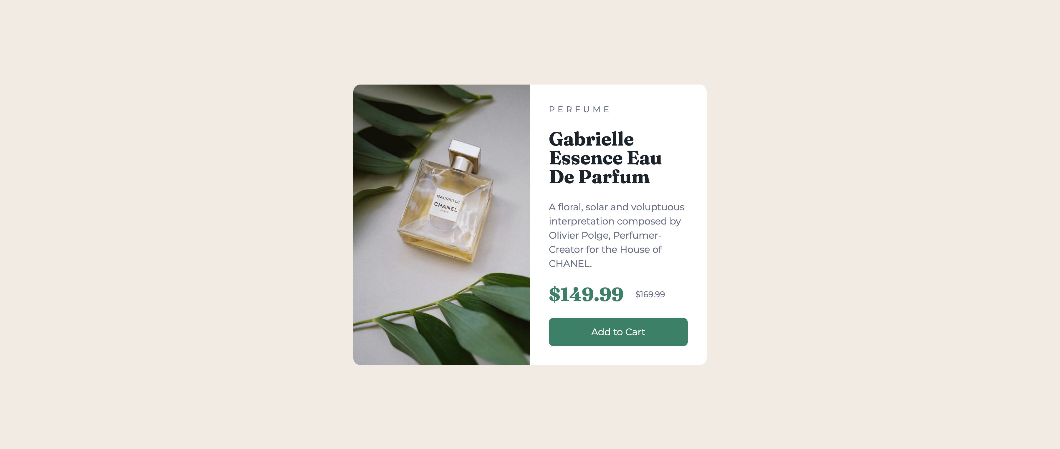
Preview image #1
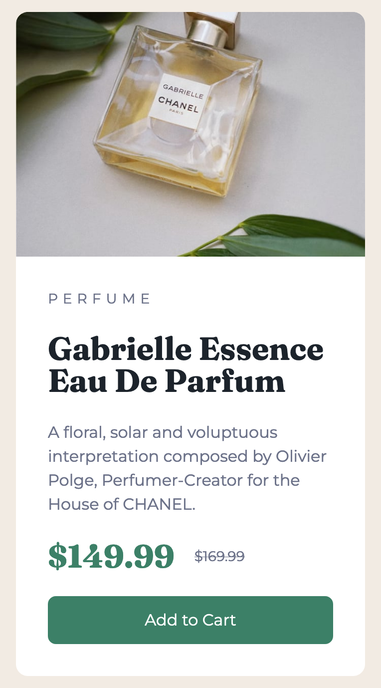
Preview image #2
The challenge
Users should be able to:
- View the optimal layout depending on their device’s screen size
- See hover and focus states for interactive elements
This was pretty difficult to make responsive without it moving frantically. I enjoyed the process though.
What I learned
I learned about the <picture> tag in HTML. How crazy I’ve been using same <img> tags but just use hidden and block when appropriate sizes.
<picture>
  <source srcset="/perfume-desktop.jpg" media="(min-width: 640px)" />
  <img src="/perfume-mobile.jpg" alt="Perfume" class="h-full" />
</picture>